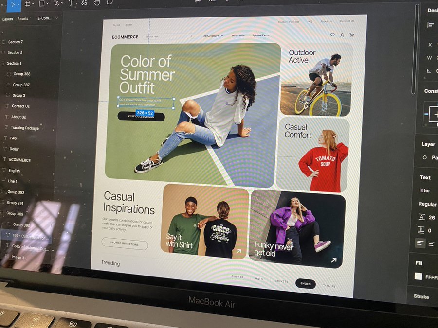
Here’s a little trick for alignment. Not much difference, IMO. Unless you’re a perfectionist, just setting p-8 is good enough.
You might also like:
Your inbox is full of AI-generated sales emails that you don’t care about. Especially in enterprise, you can’t afford to miss.
Therefore, we’re taking a different approach to breaking into new accounts.
– Identify and act on strategic insights in real-time
– Write outbound that
Original post: View on X.com
This is a Mac Tool that Renames your Screenshots based on the content of the image
Original post: View on X.com
AI is changing the game in every single industry!
Here’s how I created this ad for a makeup brand in just 3 easy steps using AI:
1. Generated product shots with
Original post: View on X.com
Introducing Veo 2, our new, state-of-the-art video model (with better understanding of real-world physics & movement, up to 4K resolution). You can join the waitlist on VideoFX. Our new and improved Imagen 3 model also achieves SOTA results, and is coming today to 100+ countries
Original post: View on X.com
- View
- @namyakhann
Your landing page = 24/7 sales machine.
But 99% of people have no clue how to build one.
Here’s how to make sales in your sleep:
Original post: View on X.com
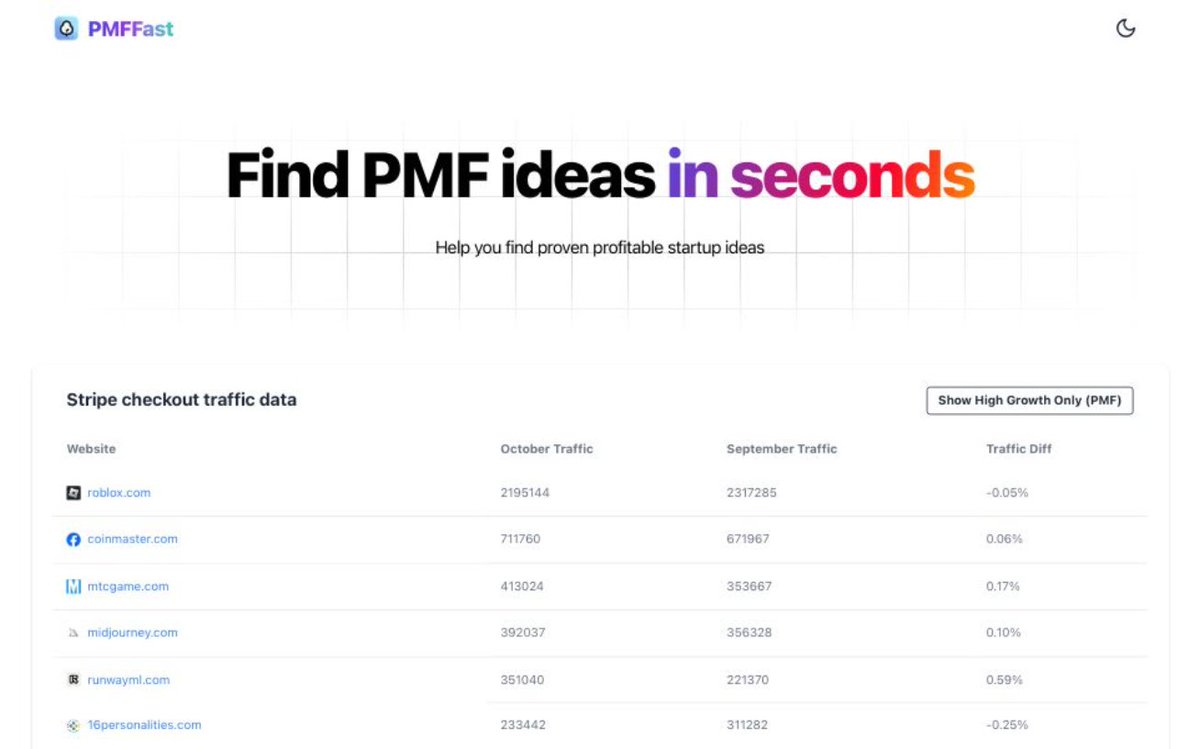
I’m tired of failed startup ideas, so I gathered traffic data from 10,000 websites that redirect to Stripe payment pages.
By analyzing traffic data, I can find whether an idea is PMF.
I’ve turned this into a free app and made it publicly available.
The link is in the reply.
Original post: View on X.com
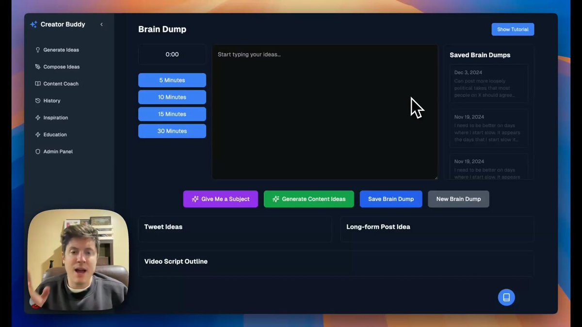
This is Creator Buddy! It’s an AI tool that helps you come up with more ideas for content.
My goal with creating this tool is to help everyone find their voice so they can create content that attracts an audience
It’s like your own personal AI content coach!
Hope you like it!
Original post: View on X.com


